
The onslaught of year-end lists is upon us, and in the econoblogosphere that means, among other things, charts. Lots of charts.
The Atlantic’s Matthew O’Brien rounds up the most important economic stories of 2013 from 44 journalists, economists, and policy experts. Business Insider’s Matthew Boesler has 100-plus charts from investors and Wall Street analysts. The Counterparties team sorted through O’Brien and Boesler’s lists, as well as our own catalogue of charts, to semi-arbitrarily bring you the 8 best charts (of the best charts) of the year:
1. Wages detaching from productivity

This chart from the Economic Policy Institute (cropped from the original for space reasons) shows how wages haven’t kept up with productivity increases since the 1970s. Today, the president of the EPI tweeted that this would be the chart on his tombstone.
2. The long-term unemployment crisis
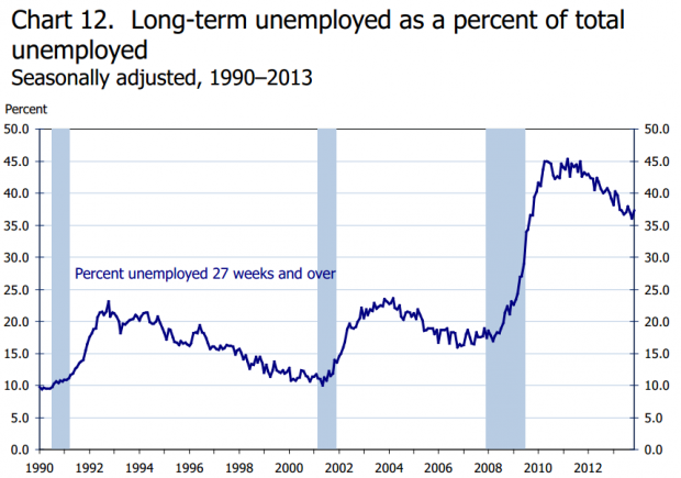
The BLS charts the rise in long-term unemployment, which has surged since the financial crisis. As a result, AEI’s Michael Strain writes that millions of workers are “suffering financially, emotionally, spiritually… Society is also suffering: A large pool of willing and able workers are idle; our already segmented society is even more segmented; our country is less dynamic, vibrant, and thriving”.
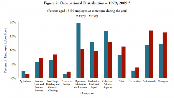
3. The 30-year decline of middle class jobs
Here’s Cardiff Garcia: this “graph shows is that middle class employment is much smaller as a share of the employed labor force than it was three decades ago”. Occupations are ordered from the lowest to highest paid, left to right.
4. America’s shrinking workforce
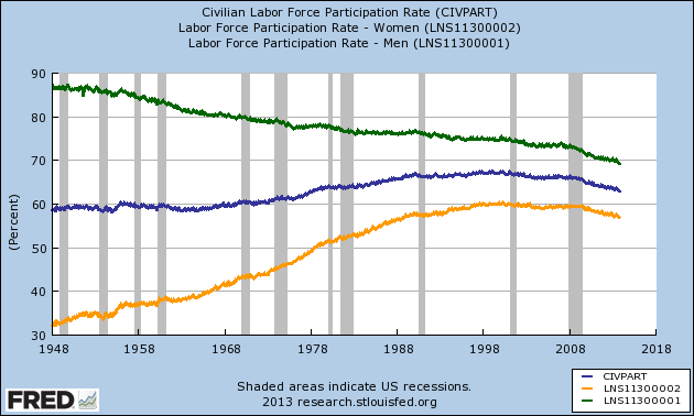
This shows the labor force participation rates for men (green), women (orange) and the overall rate (blue). From 1948 (when we started collecting data) to roughly 2000 the trend was mostly the same: women were joining the labor force in pretty consistent numbers, driving the overall workforce up, even as men dropped out. Then, in 2000, something happened. Suddenly, the female and overall rates flatline and head downward after the recession. And it doesn’t look like it’s going to get better anytime soon, either.
5. 2013 was a great year for stocks
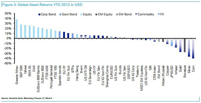
Surging stock markets in the developed world were a huge story this year. This chart from Deutsche Bank, via Tracy Alloway, shows just how well you would have picked, relative to other asset classes, if you picked developed economy stocks 12 months ago.
6. The government-dominated bond market
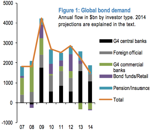
Felix spotted this chart via JP Morgan’s Nikolaos Panigirtzoglou: “central-bank buying accounts for $1.6 trillion — more than half — of the total demand for bonds in 2013”.
7. Where did the inflation go?
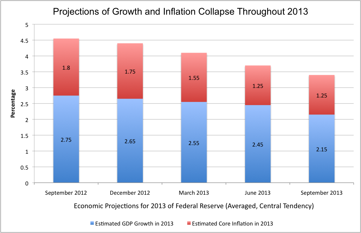
This chart, in Mike Konczal’s words, shows “the collapse in inflation after the overhaul of policy introduced by the Federal Reserve in late 2012 to hit its inflation target”. US inflation is historically low, and below the Fed’s 2% target -- which is a major factor why Fed policymakers are still committed to keeping the central bank’s short-term interest rates near zero.
8. The rise of web headlines featuring the phrase “in one chart” In One Chart:

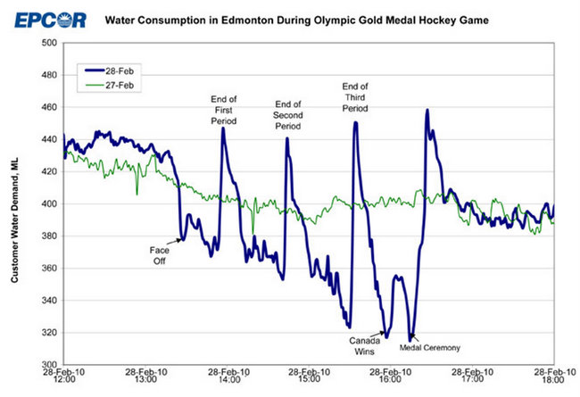
Honorable mention (due to its being resurfaced from 2010): Measuring how much Edmonton loves hockey, flush by flush.
Unfortunately disqualified due to its 2010 publication date, this chart shows Edmonton’s municipal water consumption, which is overwhelmingly driven by the number of toilet flushes, the day before and the day of the Olympic gold medal hockey game.
— Shane Ferro and Ben Walsh
On to today’s links:
Long Reads
Miami Babel: A weekend in the art world’s most baffling, velvet-roped, celebrity-filled spectacle - Shane Ferro
Charts
How we spend - Matthew Klein
Pivots
The "self-proclaimed creator of the ‘Occupy’ meme, has formed his own boutique activist consultancy" - Overland
Why an epidemiologist with a Stanford PhD became a fruit picker - NPR
Alpha
An in-depth look at Wall Street's historic move to centralize America's home rental market - Bloomberg
Fascinating
"Trust is valuable, but it is in short supply among low-income people who don't feel trusting is safe" - Boston Review
Must Watch
"Why does First Round Capital’s holiday video feature a talking camel and its founder riding a wrecking ball (in a fat suit)?” - Bess Levin
Oxpeckers
Study: Snowfalling mostly succeeds in disorienting readers - Fast Company
Wow
"32 pounds of flour, over 100 individual tests, and 1,536 cookies later I had my answers" - Serious Eats
Felix
Mark Zuckerberg has started cashing out of Facebook in a really big way - Reuters
White Collar Crime
A reminder that the sexy, dangerous Wolf of Wall Street pretty much ruined some investors' lives - NYT
Follow Counterparties on Twitter. And, of course, there are many more links at Counterparties.
| |||||||||||||||||||||
No comments:
Post a Comment