Bach Cello Suites visualized
Dec 08, 2011 03:09 am As a resident at Eyebeam, Alexandar Chen visualizes the first Prelude from Bach's Cello Suites: Using the mathematics behind string length and pitch, it came from a simple idea: what if all the notes were drawn as strings? Instead of a stream of classical notation on a page, this interactive project highlights the music's underlying ...
Continue reading → On low-quality infographics
Dec 08, 2011 12:58 am This has been sitting in my drafts folder for a few months. Figured I'd just hit publish and throw it out there. Obvious statement: there are infographics that are horribly made. Some are way too big for the information conveyed and others are useless because the creator had no idea what he was doing. Some ...
Continue reading → Visualize This: Signed copies available
Dec 07, 2011 04:33 pm Quick announcement: I have a handful of signed Visualize This copies available in case you're looking for a gift for that data geek cousin or you're up for some learning over the holidays. I only have a limited supply, so grab a copy before they're gone. And of course, you can still get an untarnished ...
Continue reading → Rise and fall of riot rumors on Twitter
Dec 07, 2011 03:55 pm 
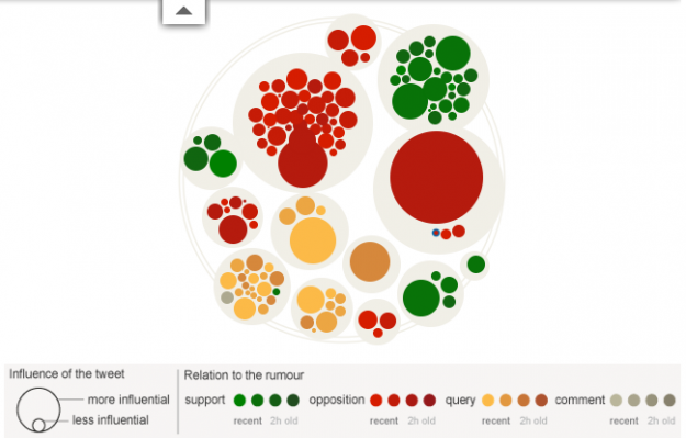
During the riots in London this past summer, a lot of information spread quickly about what was going on. Some of that information was true and some was not so true. The Guardian explores this spread of information on Twitter, and how fact and fiction seem to reveal themselves on their own: A period of ...
Continue reading → Every death on the road in Great Britain
Dec 07, 2011 12:07 am 
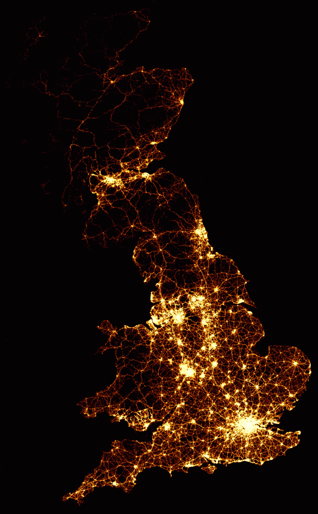
As part of their series on road accidents, BBC News mapped every recorded death on the road in Great Britain, from 1999 to 2010. That's 2,396,750 road crashes. As you'd expect, the map looks a lot like population density, but check out the videos, which show twelve years of data compressed as if it were ...
Continue reading → 40 years of boxplots
Dec 06, 2011 12:54 am 
Famed statistician John Tukey created the boxplot in 1970. It shows a distribution summary in a small amount of space. Hadley Wickham and Lisa Stryjewski look back on the old standby and its evolution up to present. Keep it in mind, while still used today, the boxplot was created with pencil and paper. One of ...
Continue reading → What seven billion people looks like
Dec 05, 2011 12:12 am 
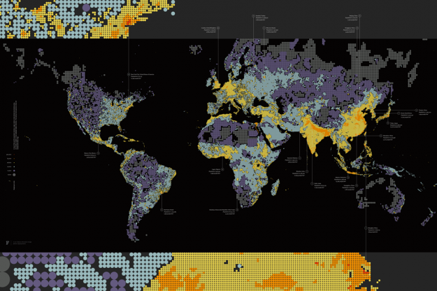
Form design intern at Fathom, James Grady, maps population density in Dencity: Dencity maps population density using circles of various size and hue. Larger, darker circles show areas with fewer people, while smaller, brighter circles highlight crowded cities. Representing denser areas with smaller circles results in additional geographic detail where there are more people, while ...
Continue reading → Smiley installation shows the mood of a city
Dec 02, 2011 12:32 am 
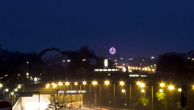
Project Stimmungsgasometer (say what?) is a giant smiley face that changes based on the mood of Berlin citizens. When they are collectively "happy" the light is a smile, and when they are not, it is a sad face. Input comes from facial recognition software that takes in video from a strategically placed camera. The software ...
Continue reading →
No comments:
Post a Comment