| | Perpetual Ocean Mar 27, 2012 12:32 am • Permalink Using a computational model called Estimating the Circulation and Climate of the Ocean, Phase II (ECCO2), the NASA Goddard Space Flight Center Scientific Visualization Studio (I think NASA has a thing for long names.) visualizes surface currents around the world. This is beautiful science here. Make sure you turn on high-def and go full screen. [via @aaronkoblin]  What News Sites People are Reading, by State Mar 26, 2012 11:00 am • Permalink 
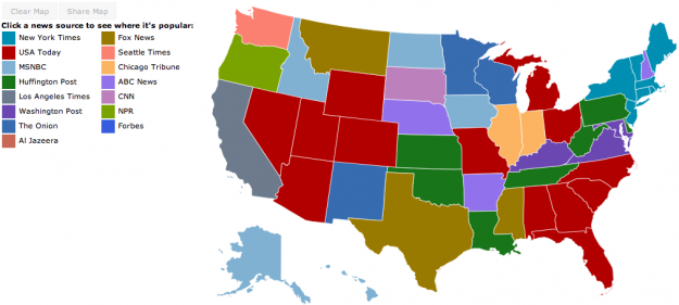
Jon Bruner of Forbes, in collaboration with Hilary Mason and Anna Smith of Bitly, maps the most popular news source by state. Bitly's dataset, wrangled by data scientists Hilary Mason and Anna Smith, consists of every click on every Bitly link on the Web. Bitly makes its data available publicly—just add '+' to the end of any Bitly link to see how many clicks it's gotten. For Bitly's collaboration with Forbes, Smith and Mason looked for news sources and individual articles that were unusually popular in certain states compared to national averages. The interactive map starts by showing which news source dominates in each state by this measure: the Washington Post in Virginia and Maryland, the Chicago Tribune in Illinois, and so on.
You can also select news sources to their click distributions across the country. I like how The Onion leads in Minnesota, Wisconsin, and New Mexico, although I'd be interested to know what other news sources the states read. A color scale might be informative, too.  | Sponsored by:
 More to read: | |
No comments:
Post a Comment