Redefining NBA Basketball Positions
Mar 21, 2012 12:25 am • Permalink 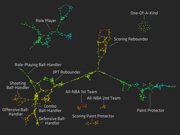
For the MIT Sloan Sports Analytics Conference a few weeks ago, Stanford biomechanical engineering student Muthu Alagappan presented his work on redefining basketball positions.
After studying players like LeBron James and Blake Griffin, many analysts are now suggesting that there are new positions, which are simply hybrids of the one's we already had. For example, some players are now labeled "point-forwards" or "combo-guards." But what if we were wrong about our initial five positions. Maybe a "Center" is just a label for people over a certain height, and there are actually three different types of big men in the NBA.
An analysis provided 13 possible positions, as shown above. Nodes and edges are colored by points per minute on a blue (low) to red (high) scale.
So for example, those typically classified as centers or power forwards are classified as scoring rebounders, paint protectors, and scoring paint protectors. Dirk Nowitzki might be considered a scoring rebounder, whereas Joakim Noah is a paint protector.
The point? Hopefully teams can use this information to make better decisions about who to trade and draft. Of course, I'm sure scouts know about these fuzzy positions already, so I think the next step is to look at what positions the best teams have and had, and more importantly, how a "one-of-a-kind" player can change everything.

Innovation History via 6,000 Pages of Annual Reports
Mar 20, 2012 06:00 pm • Permalink 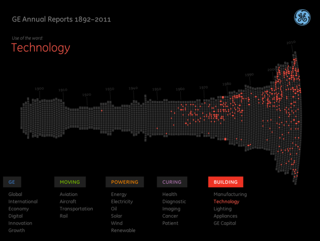
Fathom Information Design, in collaboration with GE, visualizes GE annual reports from 1892 to 2011. It doesn't sound so interesting at first, but browse the appearance of keywords, and you do get a sense of change.
We've scanned 6,000 pages of GE's annual reports to build this interactive visualization. But why? What's the point? Not only does this provide a rich history of how GE has always been at work building, moving, powering and curing the world, but it is a true reflection of how the economy, U.S. and the world as a whole has progressed from 1892 until 2011. By diving deep into key terms, users can uncover interesting stories about innovation over the last century.
Each column represents an annual report, and each little square represents a page. Select a keyword, and pages that use that word are highlighted. Finally, you can actually read each page of the report by clicking on a column. It expands.
The interactive is best in full-screen mode.

Towards a Low-carbon World
Mar 20, 2012 11:05 am • Permalink 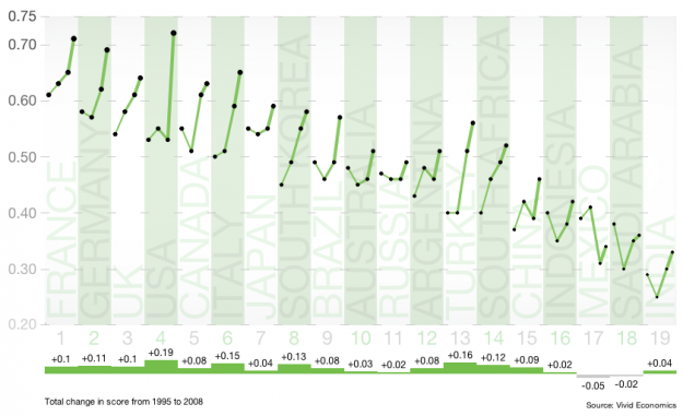
Carbon output. We want to reduce it, but some countries have a longer way to go than others. Pitch Interactive shows progress (or non-progress) by country in this interactive for the Climate Institute. Three indices are shown along with an overall score, which is a composite of the three, and countries are sorted by the average score from 1995 to 2008. Higher scores are better.
The interaction makes this graphic. When you switch between indices, the countries are sorted appropriately and the time series for each country are drawn. You can also click on a country to get a closer view, which albeit is only four data points per country and index, but it's still useful.
The lines for each country get thicker from left to right, which was to provide a sense of progress, but I wonder if it would be worthwhile to use thickness to represent an increase or decrease from the previous year. Then again, that's easy enough to see already, so maybe not.


No comments:
Post a Comment