Fat and calories depicted in food pictures
Jun 07, 2012 12:29 am • Permalink 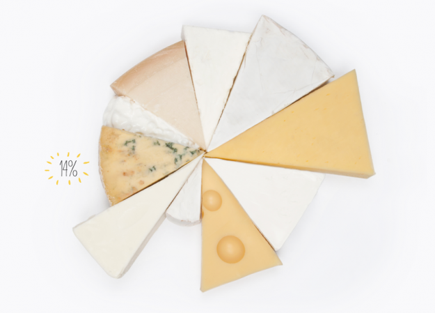
You would think that fat content and calorie counts would be straightforward by now, but serving size mucks it all up. It's like, "Great, this ice cream is only 200 calories!" Then you come to the sad conclusion that you just ate a bowl worth half a million calories, because the serving size is that of a rice grain. Fat or Fiction tries to clarify some of these fat counts, for items like cheese and cake, by placing food servings next to each other.
Some of the labeling is confusing, because it's off to the left and in small print. For example, the 14 percent above is the percentage of fat in that wedge of blue stilton cheese against the rest of the wheel. Each wedge is 100 grams of cheese, so you get a sense of fat and calorie density.
But hey, I'm a sucker for anything food-related and these pictures are making me hungry. That's the goal of the site, right?
Related

Always label your axes
Jun 07, 2012 12:08 am • Permalink 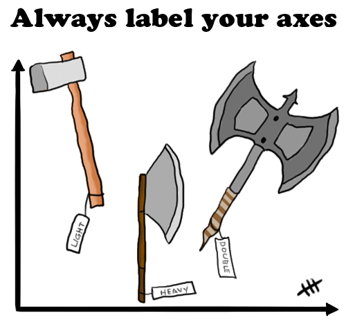
From Fluffware, here's a fine reminder to always label your axes. See, it's funny because usually when we talk about labeling axes, we're talking about axes on plots for context, but here axes is used as the plural of axe, so there are labels on several axes. It's a play on words. More specifically, it works because axes on a plot and axes the wood-cutting tool are homographs. They're two words with the same spelling but are pronounced differently. So the joke works with the written word, but it would not work if I were to tell it to you in person. Just to be clear, you should always label both types of axes. Tool and plot, that is. I mean, let's say you asked someone who only knew about axes (the plot kind) to fetch a certain type of axe (the tool) from your woodshed. If you didn't label your axes (the tools), that person wouldn't have a clue. That'd be embarrassing for both parties. And don't even get me started with the spray.

Income inequality seen in satellite images from Google Earth
Jun 06, 2012 04:45 am • Permalink 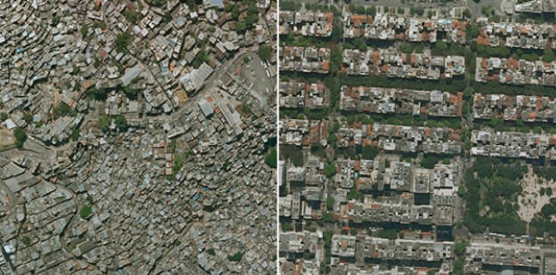
Researchers Pengyu Zhua and Yaoqi Zhang noted in their 2008 paper that "the demand for urban forests is elastic with respect to price and highly responsive to changes in income." Poor neighborhoods tend to have fewer trees and the rate of forestry growth is slower than that of richer neighborhoods.
Tim De Chant of Per Square Mile wondered if this difference could be seen through satellite images in Google Earth. It turns out that you can see the distinct difference in a lot of places. Above, for example, shows two areas in Rio de Janeiro: Rocinha on the left and Zona Sul on the right. Notice the tree-lined streets versus the not so green.
De Chant notes:
It's easy to see trees as a luxury when a city can barely keep its roads and sewers in working order, but that glosses over the many benefits urban trees provide. They shade houses in the summer, reducing cooling bills. They scrub the air of pollution, especially of the particulate variety, which in many poor neighborhoods is responsible for increased asthma rates and other health problems. They also reduce stress, which has its own health benefits. Large, established trees can even fight crime.
Okay, I don't now about that last part about fighting crime. Without seeing the data, I think that sounds like a correlation more than anything else, but still. Trees. Good.
[via Boing Boing]
Related


No comments:
Post a Comment