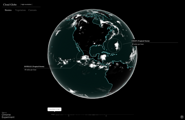
In the latest Chrome experiment,
Google mapped cloud coverage around the world in Cloud Globe. The interactive animation shows coverage from July 1, 2010 to September 12, 2012, with a globe that you can move around as expected and a timeline on the bottom that indicates high levels of coverage. As the animation plays through, storms are highlighted with a circle and pointer. Finally, you can turn on the vegetation layer, and the green regions happen to be under the clouds. Imagine that.

Jo Wood, a professor of visual analytics,
visualized five million bike rides using data from Barclays Cycle Hire.
In the animation (see below) the least travelled routes begin to fade out after about 15 seconds - "like a graphic equaliser," says collaborator Andrew Huddart, also at City University. Around the 1-minute mark, structure emerges from the chaos and three major systems become clear: routes around, and through, the lozenge-shaped Hyde Park in the west, and commutes in and out of King's Cross St Pancras in the north and between Waterloo and the City in the east.
Each arc represents a trip from point A to point B (obviously not a true path or we'd see roads), and flow direction indicates which way people went the most between the two. [via
The Guardian]

No comments:
Post a Comment