Length of the average dissertation

On R is My Friend, as a way to procrastinate on his own dissertation, beckmw took a look at dissertation length via the digital archives at the University of Minnesota.
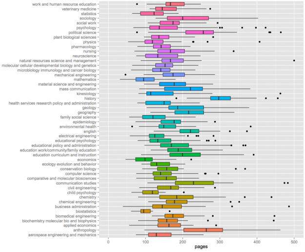
I've selected the top fifty majors with the highest number of dissertations and created boxplots to show relative distributions. Not many differences are observed among the majors, although some exceptions are apparent. Economics, mathematics, and biostatistics had the lowest median page lengths, whereas anthropology, history, and political science had the highest median page lengths. This distinction makes sense given the nature of the disciplines.
I was on the long end of the statistics distribution, around 180 pages. Probably because I had a lot of pictures.
As I was working on my dissertation, people often asked me how many pages I had written and how many pages I had left to write. I never had a good answer, because there's no page limit or required page count. It's just whenever you (and your adviser) feel like there's enough to get a point across. Sometimes that takes 50 pages. Other times it takes 200.
So for those who get that dreaded page-count question, you can wave your finger at this chart and tell people you're somewhere in the distribution.
Data Points: Visualization That Means Something is available now. Order your copy.
YouTube Trends map shows most popular videos by region

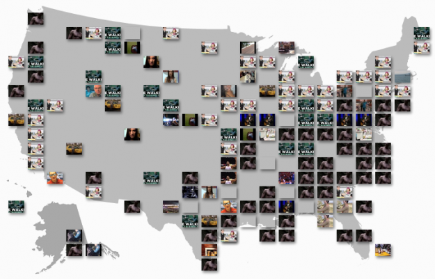
I don't know about you, but when I go to YouTube, I check my subscriptions and then look at what videos are currently popular. Because you know, it's important to stay up to date on the most current news about kittens, people getting caught doing weird things, and movie trailers. The YouTube Trends Map is another way to see what's popular, but from a geographic and demographic point of view.
As you'd expect, the map shows the currently most popular video in a region, based on shares or views, which looks like a lot of noise at first. Look a little closer though, and there are some interesting spots.
For example, looking at it now, the most popular video in the 12 to 24 year old range is a clip from Family Guy. In contrast, move to the older age brackets, and the most popular is a trailer for True Blood. The most popular clip in Oklahoma City is Kevin Durant's winning shot from Sunday's Oklahoma City Thunder game.
Finally, the map is linked with a stacked bar view, which shows the breakdown just by demographic.

I like it.
[via @viegasf and @wattenberg]
Data Points: Visualization That Means Something is available now. Order your copy.

No comments:
Post a Comment