FlowingData - Telling Stories with Data – VisWeek 2011 |  |
| Telling Stories with Data – VisWeek 2011 Posted: 04 Nov 2011 12:15 AM PDT
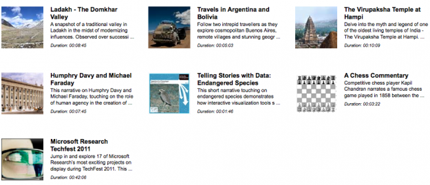
"Data storytelling" is all the rage on websites ranging from international news outlets, to political and economic organizations, to personal blogs. Indeed, this trend has captured the attention of those who research and work in information visualization. Scores of both aspiring and seasoned visual storytellers descended on the Telling Stories with Data workshop that we organized this year (the 2nd installment of the workshop) to discuss and learn about visualization storytelling tools, issues, and contexts. The workshop took place in Providence, Rhode Island on October 23rd and was part of the yearly international VisWeek conference which itself drew about 1,000 attendees. As in many technological fields, those interested in "narrative visualization" face the challenge of connecting with like-minded others across the oft un-negotiated boundary between academic research and practical applications or designs. Yet these groups have much to learn from one another. To bring visualization research in contact with visualization practice, we structured the workshop line-up of speakers to include both academicians (e.g. from Harvard, UC Berkeley, UIUC) and people from industry (e.g. New York Times, Microsoft Research, OECD, Workbook Project). The talks were organized into three blocks: (1) tools for structuring and sharing, (2) communicating with visualization, and (3) storytelling in context. In the rest of this post we'll share some highlights and take-aways from the talks and discussions that took place throughout the workshop. And for a fuller experience don't miss the set of provocative questions [pdf] we used to instigate discussions after each session. The workshop got started with a few talks that dove right into talking about the state of the art in visualization tools that support data storytelling. First to speak in the tools session was Dr. Steven Drucker from Microsoft Research. Steven presented the Rich Interactive Narratives (RIN) project from MSR where they're working out how to build storytelling features (like sequences, transitions, highlights and annotations, comparison and contrast) into authoring tools that support visualization (and other multimedia). Something particularly interesting about RIN is that, although there is an authored "path" through a story, the user can step off that path at any point, pausing time, and explore the underlying visualization. This ability is key to creating a charismatic, multi-modal presentation (think Hans Rosling's GapMinder). This seems like a valuable feature so that people get the best of both the author's story as well as giving flexibility to explore on your own.
Next up was Wesley Willett, a Ph.D. student at UC Berkeley, who focused on the intersection of visualization and social media. All too often links to visualizations land you back on a default view. But was that what the person was looking at when they decided to share the vis? In an insightful presentation that first surveyed the benefits and challenges of existing tools, Wes argued for how much more powerful social sharing can be when deep links are used to share specific views. Deep links point to a particular view-state of the visualization by encoding parameter values or navigation information in the URL. Wes also talked about a research project where he collected thousands of tweets on users' observations of the Google nGram viewer and is thinking about ways that this data can be used to identify the most interesting users, comments, and views on the visualization.
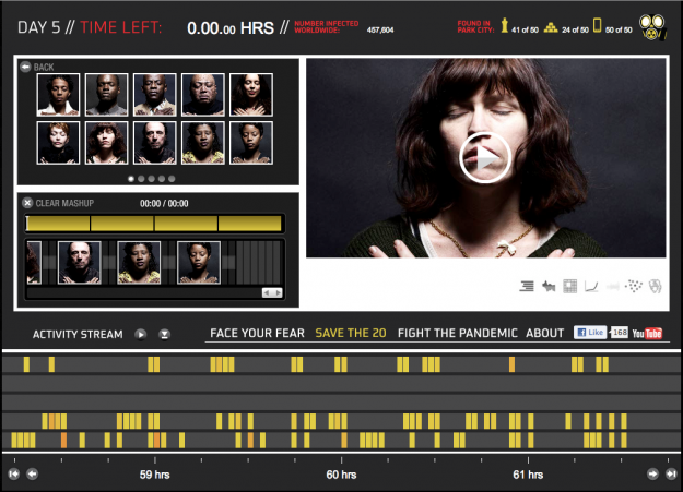
The late morning session was rounded out by Sunah Suh, a Ph.D. student at the University of Illinois, who spoke about how literacies, either InfoVis, statistical, or cultural can subtly influence what we communicate with visualizations. Her presentation raised questions about the audience(s) of visualization. What education is necessary to decode the types of visualizations that we create, and will we leave people out of the conversation if we use certain visual or cultural connotations? An example that sparked discussion was the Baby Name Voyager, in which pink and blue color coding evokes assumptions about gender. Her presentation presaged a further discussion of visualization rhetoric that occurred later in the week at VisWeek. The afternoon was focused on diverse aspects of storytelling with data and visualization and brought together perspectives from entertainment, journalism, and history. First off Lance Weiler joined us with a narrated presentation of his transmedia project Pandemic 1.0 which debuted at the Sundance Festival earlier this year. Pandemic is a seriously multi-modal story about a virus outbreak and includes media experiences spanning film, books, comics, connected toys, physical spaces and objects, games, mobile apps, and, of course, a healthy dose of visualization. What makes Pandemic so interesting from a data perspective is how social media data (e.g. tweets or Gowalla checkins) were used as inputs to the storytelling engine to influence how events unfolded.
Next, Brad Stenger of the New York Times described some ways in which data and APIs are being used in the service of telling more news-y stories. He gave the example of Katie Baker (now at Grantland.com) who built a system called NUPTIALS, which scores NYT wedding announcements according to a rubric she built. While the system was at first manual it's since been automated to use NYT APIs to access the announcements and then process them according to the scoring rubric. Reusing content for new news stories, through some derivation and transformation process, was at the heart of what Stenger talked about. What kinds of new stories are lurking in our content that we haven't even thought of yet? To wrap up the day we had an exciting and energetic talk by Harvard University historian Jo Guldi. Jo challenged the audience to think more broadly about storytelling across representations of time and space. Jo's argument was that while maps of time and maps of space have both been explored by creators of visualization going back hundreds of years, maps over time have been less common. We also learned about some exciting collections of maps such as the Spatial Humanities project, which is full of food for thought for information visualizers who want to meet the challenge Jo proposed. All in all the day was a huge success, with great turnout and healthy sharing and questioning of ideas. We'd love to hear your comments on what these ideas make you think of, and what kinds of things we should include in the next installment of the workshop. See Telling Stories with Data for more information and for future updates about the workshop. Another note from Nathan: Also have a look at last year's recap for more on data and storytelling. |
| You are subscribed to email updates from FlowingData To stop receiving these emails, you may unsubscribe now. | Email delivery powered by Google |
| Google Inc., 20 West Kinzie, Chicago IL USA 60610 | |

 Note from Nathan: Last week, visualization researchers from all over gathered in Providence, Rhode Island for VisWeek 2011. One of the workshops, Telling Stories with Data, focused on data as narrative and what that means for visualization. This is a guest post by the organizers:
 Later in the morning, we transitioned away from tool-building to thinking more deeply about how visualizations are used to communicate.
No comments:
Post a Comment