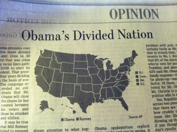
I knew things were bad, but I didn't know they were this bad. Obama has his work cut out for him. [Thanks, @adamsinger]


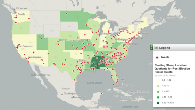
After seeing this post that highlights racist tweets after the election, Floating Sheep took a closer look at the geography. Using an estimate that takes into account number of tweets per state, the southeast came out green.
So, are these tweets relatively evenly distributed? Or do some states have higher specializations in racist tweets? The answer is shown in the map [above] (also available here in an interactive version) in which the location of individual tweets (indicated by red dots) are overlaid on color coded states. Yellow shading indicates states that have a relatively lower amount of post-election hate tweets (compared to their overall tweeting patterns) and all states shaded in green have a higher amount. The darker the green color the higher the location quotient measure for hate tweets.
I wondered about Asian remarks after seeing this, but a quick search was depressing and I stopped. [Thanks, Matt]

In 1979, Joy Division released their album Unknown Pleasures, and the cover was an image of readings from a pulsar. That image grew into a cultural phenomenon. With the kick off of the new Visualized conference in New York, this short video explores the growth of the icon. [Thanks, Eric]

No comments:
Post a Comment