Getting Started with Charts in R
So you want to make some charts in R, but you don't know where to begin. This straightforward tutorial should teach you the basics, and give you a good idea of what you want to do next.
Install R
I know, I know, the R homepage looks horrible, but just ignore that part.Of course, you need to actually have R installed and running on you computer before you do anything. You can download R for Windows, OS X, or Linux here. For Windows, download the base and the latest version. It's a .exe file and quick installation. For OS X, download the latest .pkg, which is also a one-click install. For the Linux folk, I'll leave you to your own devices.
Loading and handling data
A function is a way to tell the computer what to do. The c() function is short for "combine" so you essentially tell the computer (in the R language) to combine the values.You have to load and be able to handle data before you can chart it. No data means no chart. Enter the vector. It's a structure in R that you use to store data, and you use it often. Use the c() function to create one, as shown in the line of code below. (Hopefully, you've opened R by now. Enter this in the window that opened up aka the console.)
# Vector c(1,2,3,4,5)
Imagine that the values 1 through 5 are data points that you want to access later. When you enter the above, you create a vector of values, and it's just sort of gone. To save it for later, assign the vector to a variable.
# Assign to variable fakedata <- c(1,2,3,4,5)
In this example, the variable name is "fakedata." Now if you want to access the first value in the fakedata vector, use the syntax below where 1 is the index. You get back the value in that spot in the vector. Try using other indicies and see what values come up.
# Access a value from vector fakedata[1]
Did you try using an index greater than five? That would give you an "NA" value, which is R's way of saying that there's nothing in that place (because the vector only has a length of five).
Create another vector, morefake, of all a's. Notice the quotes around the a's to indicate that those are characters and not variables and that this new vector is of the same length as fakedata. Then use the cbind() function to combine the two to see what you get.
# Matrix, values converted to characters morefake <- c("a", "a", "a", "a", "a") cbind(fakedata, morefake) When you combine the two vectors, you get a matrix with two columns and five rows. The numbers have quotes around them too now, because a matrix can only have one data type. The fakedata vector has numeric values and again, the morefake vector has all character values.
However, in many cases (as you'll see soon), you want a structure that has all your values, but with columns of different data types. The data frame in R lets you do this, and it's where most of your CSV-formatted data will go. Create a data frame from multiple vectors as follows:
fake.df <- data.frame(cbind(fakedata, morefake)) fake.df$morefake <- as.character(fake.df$morefake) colnames(fake.df)
You use cbind() again to combine the vectors, and then pass the resulting matrix to data.frame(). Then convert the column that contains morefake values back to characters.
The dollar sign ($) syntax is important here. The data frame is assigned to the variable fake.df. The column names are automatically assigned the variable names of the vectors, so to access the morefake column, follow the data frame variable, fake.df, with a dollar sign and the column name.
Loading a CSV file
The CSV file is included in the downloadable source linked at the beginning of this tutorial. Be sure to set your working directory in R to the directory where the file is via the Misc > Change Working Directory... menu.With data frame and vectors in mind, load "2009education.csv" with read.csv(). The data is assigned to the education variable as a data frame, so you can access rows and columns using index values. However, unlike the vector, the data frame is two-dimensional (rows and columns), so use two indices separated with a comma. The first index is the row number, and the second is the column number.
education <- read.csv("2009education.csv", header=TRUE, sep=",", as.is=TRUE) education[1,] # First row education[1:10,] # First ten rows education$state # First columnn education[,1] # Also first column education[1,1] # First cell The data are US state estimates for people with at least high school degrees, bachelors, or higher — one column for each education level.
It's often useful to sort rows by a certain column. For example, you can sort states by the percentage of people with at least high school diplomas, least to greatest, using the order() function. The function gives you a vector of indices, which you pass to the education data frame and assign to education.high.
# Sort least to greatest high.order <- order(education$high) education.high <- education[high.order,]
Similarly, you can order from greatest to least by setting decreasing to TRUE in order().
# Sort greatest to least high.order <- order(education$high, decreasing=TRUE) education.high <- education[high.order,]
Okay, you got the data. On to charts.
Basic plotting
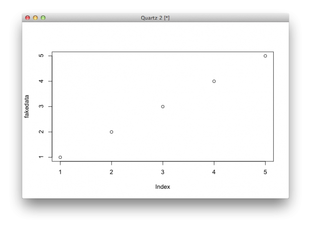
It's not that smart though. But at least it won't crash on you.R has a plot() function that is kind of smart in that it adapts to the data that you pass it. For example, plot fakedata.
plot(fakedata)
It's only a one-dimensional vector, so by default, R uses a dot plot with the values of the vector on the vertical axis and indices on the horizontal.
However, try to plot the education data frame, as shown below, and you get an error.
plot(education)
The plot() function gets mixed up, because it doesn't know what to do with the first column, which is state names, and the other columns which are numeric values. What if you plot just one column?
plot(education.high$high)
This shouldn't surprise you, because when you passed education.high$high to plot(), you gave it a vector, just like in the fakedata example.As you might expect, you get a dot plot, where each dot represents a state. Again, indicies are on the horizontal, and high school estimates are on the vertical.
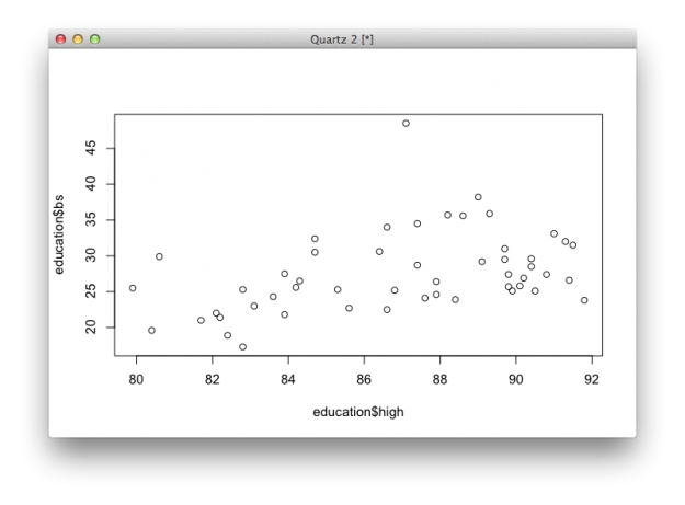
Want a scatter plot with high school on the horizontal and bachelors on the vertical? Pass plot() both columns of data.
plot(education$high, education$bs) plot(education[,2:3])
The two lines of code above give you same plot. What if you pass three columns?
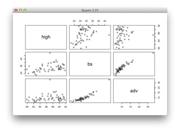
# Passing multiple columns plot(education[,2:4])
You get a scatter plot matrix. The bachelor degree and advanced degree rates are strongly correlated.
Using arguments
When you pass different valus to functions, you actually set the value of arguments. Change the values, and you get different output and charts. For example, the plot() function has a type argument, which use to specify the type of chart you want. If you don't specify, R will guess and use dots by default.
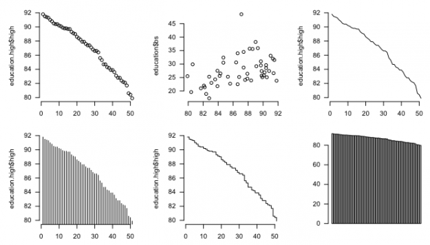
Set type to "l" and you get a line chart.
# Line plot(education.high$high, type="l")
You would never use a line chart for this particular dataset, but for the sake of simplicity, let's pretend that it's useful.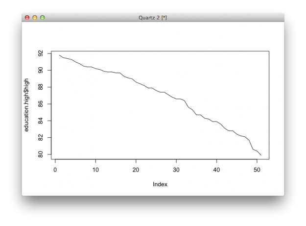
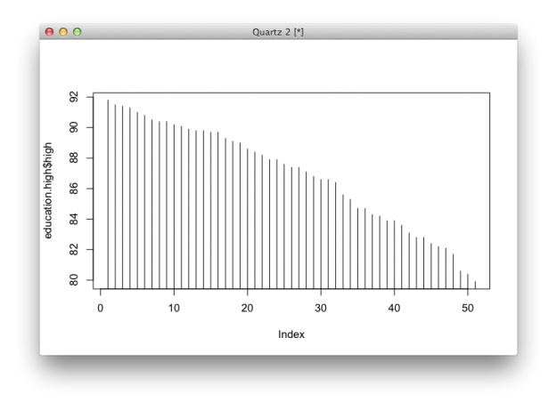
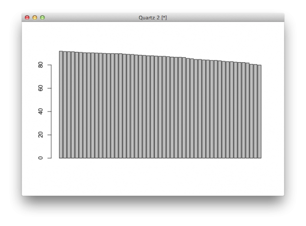
Set it to "h" and you get a high density chart, or essentially a bar chart with skinny bars.
# High-density plot(education.high$high, type="h")
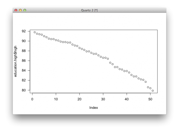
Set it to "s" and you get a step chart.
# Step plot(education.high$high, type="s")

There are several other types that you can set it to. Simply enter "?plot" in the console to see documentation for the function. Most R functions offer pretty good documentation, which you can access with a question mark followed by the function name. Use this. A lot. It might be a little confusing at first, but the sooner you can read documentation, the easier learning R (or any code really) will be.
There are quite a few other arguments to tinker with. For example, all the charts you made so far rotate vertical axis labels ninety degrees. Set las to 1 to change the label positions so that they are horizontal.
# Changing argument values plot(education.high$high, las=1)
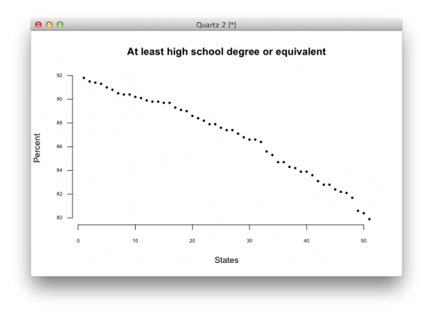
Or change labels for the axes and title with xlab, ylab, and main.
plot(education.high$high, las=1, xlab="States", ylab="Percent", main="At least high school degree or equivalent by state")

You can also set the size of shapes (cex), labels (cex.axis), remove border (bty), or change the symbols used (pch).
plot(education.high$high, las=1, xlab="States", ylab="Percent", main="At least high school degree or equivalent", bty="n", cex=0.5, cex.axis=0.6, pch=19)
You get a plot that looks a little cleaner.
Additional charts
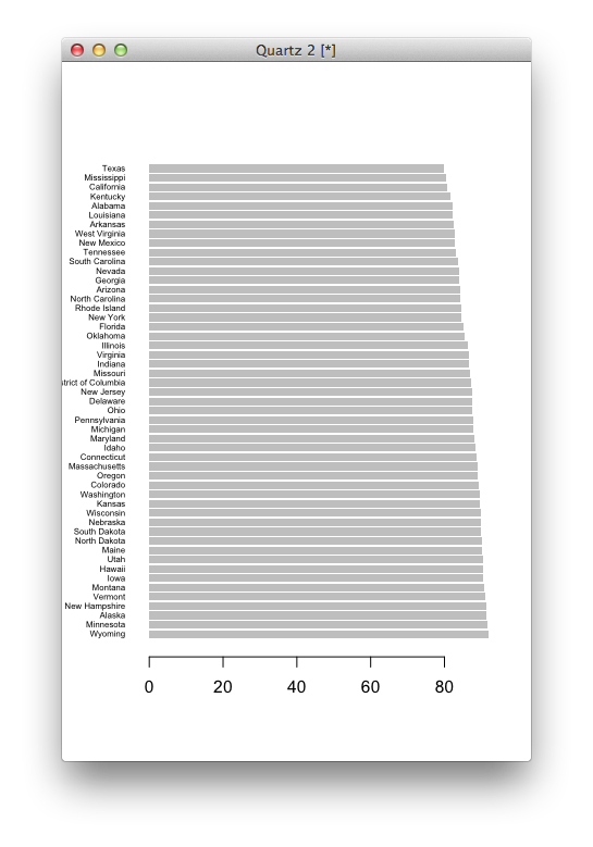
Although plot() can handle a good bit, there will be times when you want to use other chart types that the function doesn't offer. For example, the function doesn't provide a basic bar chart. Instead, use barplot().
# Bar plot barplot(education$high)
And you get a basic bar plot.
Like the plot() function, there are arguments to fiddle with to get what you want.
# Bar plot with changed parameters barplot(education$high, names.arg=education$state, horiz=TRUE, las=1, cex.names=0.5, border=NA) # Documentation for function ?barplot
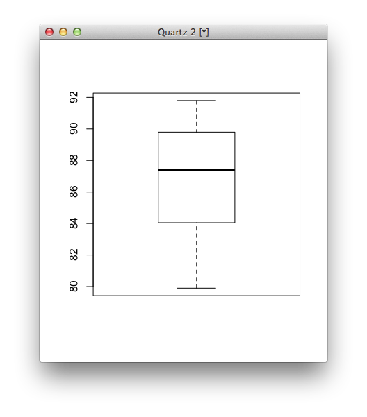
Similarly, you can use boxplot() to see distributions.
# Single box plot boxplot(education$high)
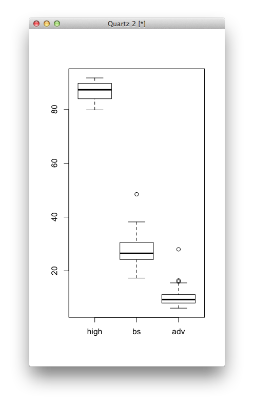
Just as easily, you can make multiple boxplots in a single space.
# Multiple box plots for comparison boxplot(education[,2:4])
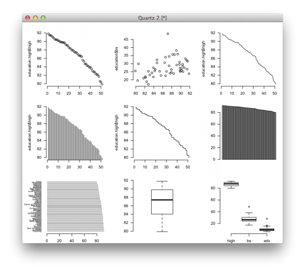
Finally, you can set some universal parameters so that you don't have to specify them in every function. For example, mfrow sets the number of rows and columns if you want to show multiple charts in the same window, and mar sets the margins in between charts. Then like in previous examples, you've seen las and bty, but now you don't have to plug it in everywhere.
# Multiple charts in one window par(mfrow=c(3,3), mar=c(2,5,2,1), las=1, bty="n") plot(education.high$high) plot(education$high, education$bs) plot(education.high$high, type="l") # Line plot(education.high$high, type="h") # High-density plot(education.high$high, type="s") # Step barplot(education$high) barplot(education$high, names.arg=education$state, horiz=TRUE, las=1, cex.names=0.5, border=NA) boxplot(education$high) boxplot(education[,2:4])
Bam. You get a grid of charts.
Wrapping up
Most basic charts only require a couple of lines of code in R, and you can make customizations by changing argument values. Use function documentation, which usually includes code snippets at the end, to learn how to use a new function. Want more? The examples in this tutorial are just tip of the iceberg.
No comments:
Post a Comment