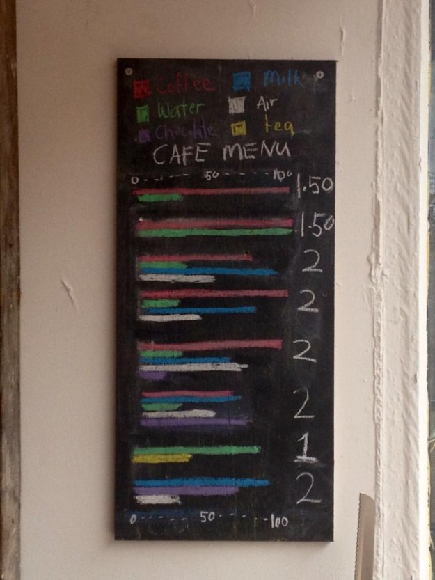
Chartspotting: Coffee graph menu

FlowingData reader Amir sent this along. In lieu of a list of coffee drinks, this place in in East London opted for ingredient breakdowns. I'm guessing there's a standard menu outside the frame somewhere, because otherwise, coffee neophytes (like me) would have no clue what to do.
Spot any charts in the wild? You should email me a picture.
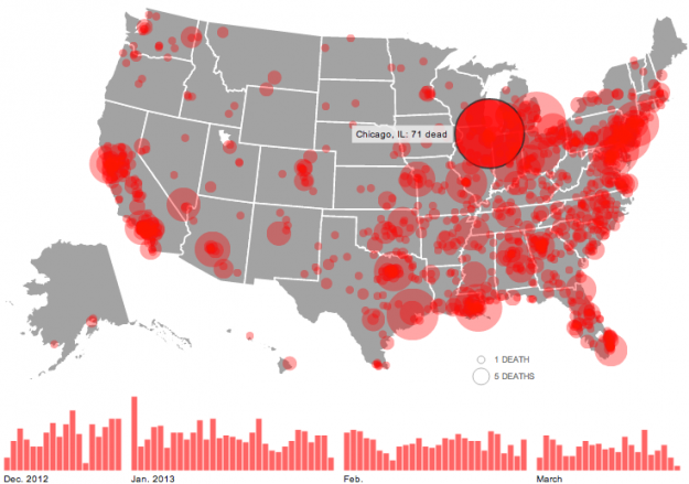
Gun deaths since Sandy Hook

The shooting at Sandy Hook Elementary School was horrible, but there have been thousands of gun deaths since. Huffington Post is mapping them.
Circles represent the number of deaths in a city, and the larger a circle the higher the count. A bar chart on the bottom shows the data over time and serves as a navigation device. Click on a day or a location, and the names of victims appear on the right with a link to the related news story.
See also: Periscopic's work on the topic, which now has filters and is updated in real-time.
Also: episodes 487 and 488 of This American Life, which focus on Harper High School in Chicago, where gang violence is a daily concern.

No comments:
Post a Comment