Venn pie-agrams
May 23, 2012 12:01 am • Permalink 
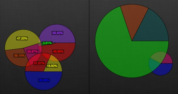
So I got to thinking, since I'm on this pie chart kick, "what would be the worst pie chart ever?" And I decided it would be a Venn diagram made with pie charts. I laughed to myself, imagining such a creation. Then I thought, somebody's probably done this. And indeed, there's an app for that.
At long last, the power of Venn diagrams and pie charts combine to turn the world of mathematics on its head! If you've ever felt the need to create Venn diagrams with pie charts, or wished your pie charts could overlap to provide even more informative data, then Venn Pie-agrams is the app for you!
I'll leave it at that.

Manuel Lima's animated talk
May 23, 2012 12:01 am • Permalink 
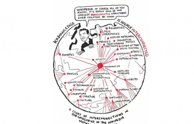
Wow, Manuel Lima, Senior UX Designer at Bing, got through a world of information in this 11 minute RSA Animate video. He spoke about the topic for which we all know him - networks. Beginning with the tree as a symbol of relationships (e.g., Aristotle's Tree of Knowledge), Manuel then quickly sweeps through many concepts through the centuries to finally land on a modern day approach to relational information, the web or network. As trees are no longer capable of representing the complexities of the modern world, we have to find new ways to visualize these structures or perhaps even find a universal structure. His talk is loaded with beautiful examples of trees and networks.
If this fast paced animation is above your processing capacity, you can view the more austere real world video of Manuel instead. It has the bonus of an interesting interview with him in the last 6 minutes.

Updated OECD Better Life index
May 22, 2012 04:01 am • Permalink 
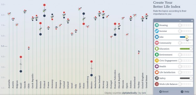
The OECD's Better Life Index which debuted last year to much fanfare has been updated with some great new features by Moritz Stefaner.
The concept and beauty of the original piece remain intact. However, the experience is made better by the ability to compare to different demographics. For instance, after I adjust my Better Life settings, I can see how my settings compare to other women my age in the US, or to French men. It's fun to compare to different people around the world and watch the flowers readjust themselves to the various comparisons. It invokes a sense of global community and humanity.

It also has better sharing. It offers the usual suspects, plus you can embed your index on your site. Equality between men and women is always a big issue, so that's addressed in the new version as well. You can select to see the split, and it also shows both gender and social inequality per indicator when you drill down to the specific country level.
This is an excellent update to an already great tool. I'm glad the OECD sees the value and continues to invest in it.
[via @jcukier]

No comments:
Post a Comment