Distance to Mars

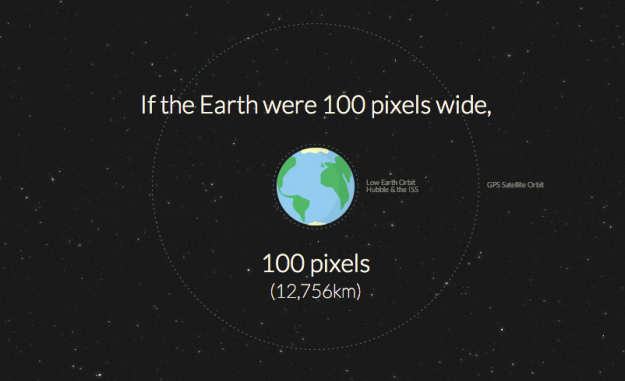
Long distances (and big numbers) can be difficult grasp. Designers Jesse Williams and David Paliwoda took a stab at it and made it easier to understand the distance from Mars. Simple and totally fun. I'm not sure how accurate the travel time and distance are, but I'm guessing it takes differing orbits into account.
A bar chart would be better
There's a strand of the data viz world that argues that everything could be a bar chart. That's possibly true but also possibly a world without joy.
—Amanda Cox, 2013
There's a great interview with Amanda Cox from The New York Times on visualization, some of the skills required, and where the field is headed. I like this tidbit on design:
Design and typography do matter. It's about hierarchy of information and how people perceive information. Done properly, that clean up work really matters. On the other hand, it's easy to believe that it matters more than it does. If you make a fantastically interesting chart and some poor design decisions, the data will still come through. If you make a bad chart with a beautiful design, what have you done, really?
Read the whole thing. Thank me later.

No comments:
Post a Comment